
Make Your Typography Stand Out
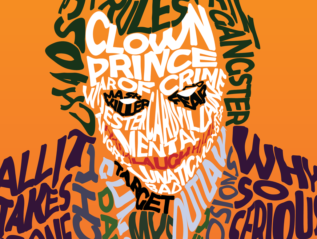
Whether it’s a movie poster, your graphic design résumé, or a new logo, choosing the right font can make or break any design. At The Los Angeles Film School, we know all about how the “simple” choice in typography can make a big difference. Whether you’re looking into online graphic design degrees or already a student, this art form surrounds you—even when you don’t notice it.
What is Typography?
Typography is the visual aspect of the written word. The Greek roots of the word actually reveal a lot about its role in graphic design: Typos = impression and Graphia = writing. Typography is the first visual impression of the written word. Your prose or poetry can be beautiful, engaging and inspiring, but if someone can’t read it, then it just doesn’t matter.
When you’re getting ready to publish anything for a future graphic design job, keep these 6 principles of typography in mind:
Font Choice
There are really two aspects of font choice. We’ll break it down for you: know your audience, and keep the number of fonts minimal. We suggest two to three fonts in total per project.
SIZE
This means the size of every part of the design. Headers, sub-headers, the main body of text, etc. For example, when creating a logo, it must clearly show the name of the business. Sometimes, size matters.
Color
There are so many principles attached to color. We could do an entire post on it. But we’ll keep it simple and say make it clear, make it contrast, and make it complimentary.
S P A C I N G
Use negative space to your advantage. Along those lines — make sure there is enough space between characters and lines to keep things legible.
STYLE
Avoid the fads in typography. They’ll look good for a few months, then your project will be dated, and your typography will fall flat.
Arrangement
This is as important as spacing and, really, they go hand-in-hand. The alignment on your page says a lot about your purpose. Something formal is usually centered. Left alignment helps people read it clearly.
Psychology Behind Font Choice
The amount of research behind font choice is staggering. While this shouldn’t consume you as you make a design choice, you definitely want to keep it in mind before you use Gigi on your resume (research suggests choosing a “stable” font like Arial, Cambria, or Times New Roman).
Fonts influence feelings. They can even prompt a physical response. People make assumptions about a movie, film, or brand the moment they see a poster or advertisement with type. Some fonts are seen as more trustworthy than others, which is a reflection upon the company.
“Fonts turn words into stories,” typographers say. A font can tell you what something is about, how it will make you feel, and whether or not you’ll like it before you even start watching a movie or reading a magazine. As French poet Paul Claudel wrote: “The secret of type is that it speaks.” It literally begins the story long before, “Once upon a time,” is uttered.
Think about the font used for the movie Titanic. It’s a clear, serif font, all caps. You know something serious and tragic is going to happen, without even pushing play on your Blu-ray.
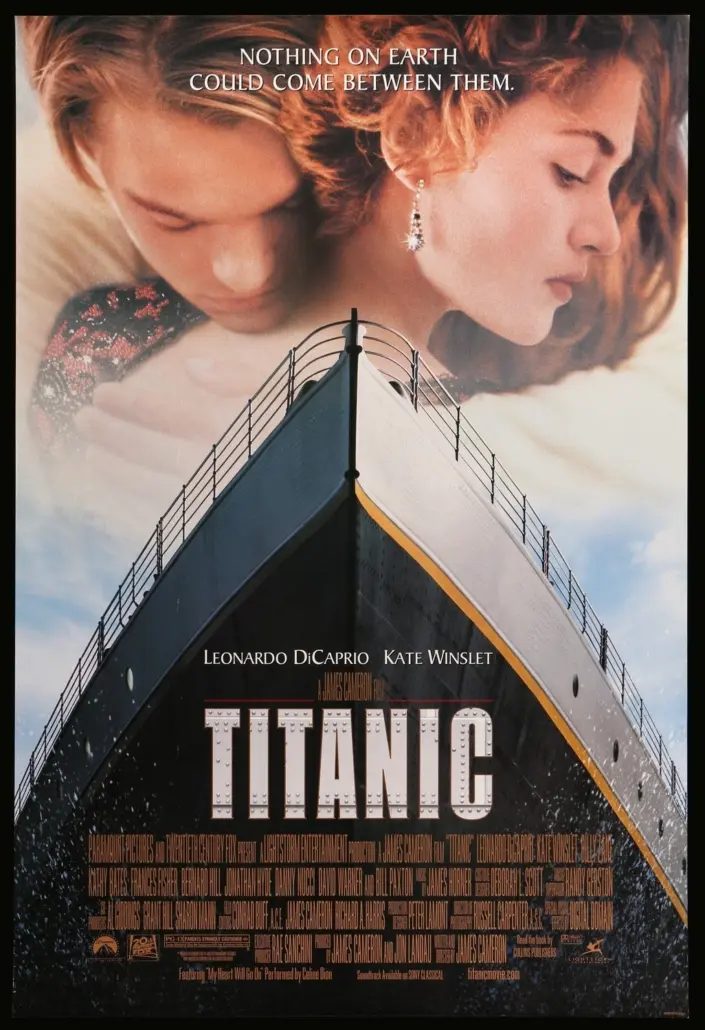
Now, imagine that same word, Titanic, in a child-like font, maybe with the hint of crayon. Now it’s silly, maybe a child’s boat in the bathtub crashing into a bar of soap. Fonts tell stories.
How to Use Typography to Your Advantage
As a graphic design student, you have the power to tell your story through typography. Once you start getting graphic design jobs, you will likely research a client’s brand identity and guidelines. Brand identity includes anything that a company uses to communicate its values, products and services. Choosing the right font can give your client’s brand the sophistication of VOGUE or the athleticism of NIKE. It’s all about how you use typography as a graphic designer to motivate and inspire your audience into action.
Here at The L.A. Film School, typography is an essential part of our graphic design curriculum. We offer an online graphic design program, which has courses in Type and Layout, Logos and Symbols, as well as Behavioral Psychology. By understanding the fundamentals of layout and fonts, you can explore the critical role that typography plays in design and how it will influence your audience.
Understanding the psychology behind words is about more than what they say. It’s about how they appear to people in the real world. What incredible power words have!
Ready to Make Every Word Work Harder?
Typography is one of the first things people notice in a design, even when they do not realize it. The font, size, spacing, color, and arrangement of your words can shape how a poster, logo, résumé, website, or brand identity feels before anyone reads the full message.
For graphic designers, type is more than decoration. It can create hierarchy, build trust, express personality, and guide an audience toward action. The more intentional your typography choices become, the stronger your visual communication can be.
At The L.A. Film School, students can explore typography, layout, logos, symbols, behavioral psychology and other design fundamentals through the online Graphic Design degree.
You can also Request Info or Apply Now when you’re ready to take the next step.
FAQs: Typography Stand Out
What Is Typography?
Typography is the visual design of written language. It includes how letters, words, and blocks of text appear through font choice, size, spacing, color, alignment, and layout.
Why Is Typography Important in Graphic Design?
Typography can affect readability, mood, brand identity, and audience response. A strong design needs text that looks good, feels appropriate and helps people understand the message quickly.
How Do You Choose the Right Font for a Design?
Choosing the right font starts with the audience and purpose of the project. A movie poster, logo, résumé, or brand campaign may each need a different type style to match the tone, message, and visual identity.
How Many Fonts Should You Use in One Design?
A clean design usually works best with a limited number of fonts. Using two to three fonts can create variety while keeping the layout organized, readable and visually consistent.
How Does Font Size Affect a Design?
Font size helps create hierarchy. Headlines, subheads, and body copy should be sized in a way that guides the viewer through the design and makes the most important information easy to notice first.
Why Are Spacing and Alignment Important in Typography?
Spacing and alignment help keep text readable and balanced. Letter spacing, line spacing, negative space, and page alignment can all change how polished, clear, or formal a design feels.
How Can Typography Influence the Mood of a Design?
Fonts can suggest emotion, genre, personality, and credibility before someone reads the full message. A serious serif font, a playful handwritten font, or a bold athletic typeface can each send a different signal.
How Can Graphic Design Students Improve Their Typography Skills?
Graphic design students can improve by studying posters, logos, résumés, websites and brand systems to see how type is used. They can also practice building hierarchy, pairing fonts, adjusting spacing, and choosing type that supports a specific audience and message
