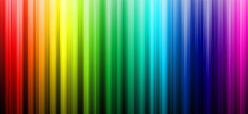
The Psychology of Color
What exactly is the “psychology of color?”
Like any other group of industry professionals, graphic designers are often limited by popular design practices. Whatever contemporary design standards are accepted as the norm are often adopted and repurposed until something new and groundbreaking comes along. Just as graphic designers have accepted the “Keep it simple, stupid” (K.I.S.S.) mantra when designing, according to research conducted in color psychology, we’ve come to view specific colors in very specific ways – and it’s something graphic designers have come to understand and accept.
Whatever your intent may be when using a certain color in your designs, the actual interpretation of that color choice may be drastically different. This means that when you’re creating your design for your audience, you must consider the psychology of color and decide whether the color scheme you want to choose is the best color scheme to evoke the right feelings and thoughts in your audience.
Using the Psychology of Color to Your Advantage
To make sure that you’re always aware of how color psychology is affecting your work and to ensure that you are always able to use the psychology of color to your advantage, keep in mind the following findings about how specific colors are perceived:

Red
Represents intense feelings, including aggression, happiness, love, and passion. Red also evokes ideas of action, adventure, and strength, and it has the ability to accelerate heart rate and breathing. The color red has also taken over food companies, restaurants, and drink brands, as it’s been found to stimulate the appetite! Just look at McDonald’s, Wendy’s, Burger King, KFC, Red Robin, In-N-Out, Carl’s Jr., Arby’s, and thousands of other restaurants, fast-food chains, and eateries throughout the country that feature red heavily in their logos and establishments. You’ll even find red in family restaurants!

Orange
Orange is a combination of red and yellow, and the emotional and mental responses it creates are very much a combination of the two, as well. Orange can represent joy, creativity and stimulation, and it’s often used to market children’s toys for that reason. However, it can also evoke thoughts of attraction, success, passion and aggression. The color orange is also related heavily to the fall because it is present very frequently during the harvest season.

Yellow
As you might expect, yellow can be viewed as a cheerful, playful and positive color – in small doses. However, while it grabs attention quickly and holds it, and it’s difficult for the eye to take in when there’s too much yellow in a space – especially when it’s a bright yellow. In fact, according to research, when in a yellow room, babies tend to cry more, and people lose their tempers more frequently. It’s also known for competence, concentration and curiosity.

Green
Possibly because much of what we see in nature is green, most people associate green with nature, healing and calmness. However, it is also viewed as relating to envy, greed, luxury and good taste.

Blue
Easily one of the most popular colors, and for good reason. The sky and water – both of which we see frequently in our daily lives – inform our understanding of the color blue. While blue can often represent calmness and peace, and can even cause the body to produce calming chemicals, it’s also a symbol that has positive meanings in the professional world. Blue tends to represent competence, loyalty, productivity and high quality. You’re probably also aware that blue represents masculinity – both consciously and subconsciously – for many, just as pink represents femininity.
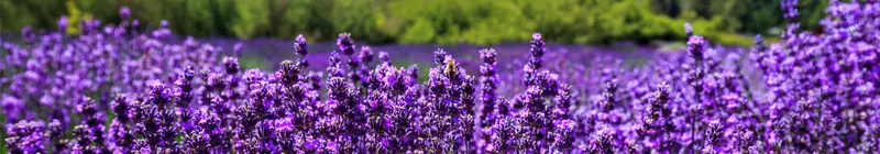
Purple
You may have heard of purple referred to as the color of royalty, and that’s how it’s come to be known, evoking ideas of wealth, luxury, sophistication, power, sincerity and authority. Purple is also seen as a rare and artificial color because it is not often seen in nature, and it’s commonly understood and used as a feminine or romantic color.

Pink
As mentioned, pink often relates to femininity, and like purple, it evokes ideas of romance and love. The color also brings to mind gentleness, gratitude, playfulness, happiness, tranquility, and innocence and youth.

Black
Black can have many meanings, according to research, including both negative and positive feelings. Black signifies grief, fear, mystery and evil, but it also evokes thoughts of simplicity, tradition and sophistication. Black is also seen in religious settings, and it’s come to be known as a sign of submission.

White
Representing innocence, purity, sincerity and happiness, white has become the traditional color for wedding dresses for this very reason. White also represents sterility, both because it’s difficult to keep clean and because it is the absence of all color, which can account for the use of white in science and medical professionals’ uniforms.

Brown
As you might expect, the color brown brings to mind earth, which evokes ideas of ruggedness, solidity and hardness, and genuineness.
To find out more about the psychology of color and how it can affect the work of graphic designers, check out these resources:
• Color Meaning, by Jen Reviews
• Color Psychology – Do Different Colors Affect Your Mood?
• How to Choose a Brand Color – Looka
Color psychology is a crucial concept for graphic designers, so at The Los Angeles Film School, we incorporate the concepts and research behind the psychology of color into what our students learn in the Bachelor of Science in Graphic Design program.
How can you implement color psychology into your own work? How have you already used color psychology to your advantage – maybe without even realizing?