
Designing Dread: The Visual Language of Horror Posters and Title Design
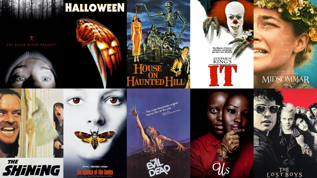
A horror movie starts working on you before you buy the ticket. A one-sheet on a lobby wall, a thumbnail in a streaming row, a title card that splinters apart in the trailer: each one is built to raise your pulse before you see a single frame of the actual film. That’s graphic design carrying the heaviest load in film marketing, selling a feeling with color theory, typography, and negative space. Horror movies have been running this play for decades. Here’s how the genre’s best key art pulls it off, and what horror poster design can teach anyone serious about visual design.
Why Horror Posters Sell Fear Before the Film Does
A horror poster has one job, and summarizing the plot is nowhere near it. It has to make you feel unsafe in the time it takes to walk or scroll past, whether it’s hanging in a theater lobby, wrapped around a bus shelter, or shrunk to a streaming tile the size of a postage stamp. That’s a harder brief than most movie poster design, because the genre runs on dread, and dread is a mood.
The strongest horror movie posters treat the poster as the film’s first scene. They establish mood and tone with the same tools a cinematographer uses on set: light, shadow, framing, and whatever gets deliberately left out of the frame. Miss that first impression and the trailer has to work twice as hard to win the audience back.
What Makes a Horror Poster Effective?
Selling an Emotion, Not a Plot
Most poster design runs on information: the stars’ faces, a tagline, a hint of the story. Horror usually goes the other way. Effective horror movie poster design isolates one image (a house, a hallway, a child’s toy) and lets the viewer’s imagination finish the scene.
The Exorcist (1973) is the textbook case. Poster designer Bill Gold later explained that director William Friedkin and Warner Bros. told him to avoid showing the possessed girl or anything with religious overtones. The final one-sheet shows a man with a briefcase arriving at a house at night, and the audience supplies everything else.
The First Impression That Sets the Tone
Think of a poster as the brand identity for a film nobody has seen yet. The weight of the type, the temperature of the color, and the amount of empty space around the subject all signal what kind of fear is coming. Slow-burn dread reads differently than jump-scare chaos, and audiences pick up on the difference even when they can’t explain it.
How Does Negative Space Create Tension in Horror Design?
Using Emptiness to Unsettle the Viewer
Negative space is horror’s cheapest special effect. A single figure in the corner of a mostly black poster does more to your nervous system than a frame crowded with gore. Negative space in design works here because emptiness reads as absence, and in horror, absence implies something is about to fill it.
- Hereditary (2018) builds its poster around a dollhouse, a nod to the obsessive miniatures Toni Collette’s character builds in the film. A child’s toy should read as safe. Shrunk to dollhouse scale, the family home turns its occupants into figures someone else is arranging.
- Rosemary’s Baby (1968) sets Mia Farrow’s face over a rocky crag with a small black baby carriage perched on top. The carriage, reportedly photographed on rock outcrops in Central Park, carries the threat.
- A door left slightly ajar in an otherwise empty frame does work that a paragraph of tagline copy can’t.
- Cropping a figure so most of the poster is “nothing” forces the eye to hunt for the threat instead of being handed it.
What the Eye Fills In on Its Own
This is visual psychology doing its job. Gestalt psychologists call it closure: the brain completes partial shapes and fills gaps without being asked. Horror designers exploit that instinct on purpose. Show ten percent of a shape, let the viewer imagine the other ninety, and the version in their head will be worse than anything you could have painted.
Why Do Horror Posters Use Color Restraint?
The Power of a Limited Palette
Scroll the horror row of any streaming service and the restraint shows up fast: black, near-black, and one accent color doing the emotional work. A limited color palette is color theory with the safety off. Strip out every hue that could soften the mood, and whatever survives gets the viewer’s full attention. (For more on how individual hues carry meaning, see our guide to the psychology of color.)
When a Single Color Does All the Work
- Orange against black: Bob Gleason’s poster for Halloween (1978) merges a jack-o’-lantern with a hand gripping a kitchen knife. Gleason has said the studio initially turned the idea down and asked for the mask, then came back to it a few days later.
- Sickly greens and yellows read as decay and infection, a go-to for supernatural and body horror.
- Sunlight can be just as unsettling. Midsommar (2019) built its campaign around flowers and bright daylight, which is exactly why it felt wrong.
- Then there’s the rule-breaker. Saul Bass‘s original poster for The Shining (1980) is bright yellow, with a stippled, barely human face packed inside the “T” of the title. Bass reportedly worked through hundreds of drafts before Stanley Kubrick signed off.
A minimalist poster built around one dominant color often communicates tone faster than a fully rendered photographic image, because the eye registers color before it reads detail.
How Is Typography Used to Create Fear?
Distorted, Broken, and Hand-Scrawled Type
Horror typography rarely behaves. It cracks, drips, bleeds, and warps, because clean, professional lettering reads as safe. Title design does real narrative work here: a title that looks carved into a wall tells you what kind of night you’re in for before a single review does. The same principle drives on-screen titles, and our look at title sequence design covers how type and motion set the tone in a film’s opening minutes.
Why Horror Type Breaks the Rules
Every rule of legible typesetting exists to make text easy to read. Horror title design breaks those rules on purpose, trading some legibility for atmosphere:
- Jagged, distorted typography with hand-scrawled letterforms signals chaos and instability, a staple of slasher and possession films.
- Thin, elegant, barely-there type signals slow psychological dread.
- Type that looks burned, scratched, or degraded implies the story has already gone wrong.
The trade has limits. Kubrick’s handwritten notes on Bass’s rejected concepts for The Shining include complaints that the title was hard to read. Horror typography can unsettle the viewer, but the viewer still needs to know what movie they’re looking at.
What Are the Common Composition Techniques in Horror Posters?
Symmetry, Isolation, and the Uncanny
Perfect symmetry should feel calm. In horror it feels wrong, and that contradiction is the point. Rigid, centered compositions produce uncanny imagery: pictures that look almost normal, with one detail slightly off. That near miss unsettles the brain more reliably than an outright monster, which is why symmetry and isolation show up in so much of the genre’s key art.
Guiding the Eye Toward Dread
Every strong horror one-sheet controls where your eye lands first, second, and third. Designers call that visual hierarchy, and the researchers at Nielsen Norman Group define it as arranging elements so the eye takes them in by order of importance, using contrast, scale, and grouping. Horror poster composition uses the same mechanics, then withholds the payoff. The threat sits at the edge of the frame or slips out of focus, so the eye keeps circling back to find it.
How Do Visual Conventions Change Across Horror Subgenres?
Slasher, Supernatural, and Psychological Design Cues
Fear looks different depending on where it comes from, and the best film key art matches its visual language to its subgenre:
- Slasher key art favors bold, high-contrast type and a weapon or masked figure as the focal point.
- Supernatural horror leans on hazy negative space and pale, washed-out color to suggest something that isn’t fully there.
- Psychological horror favors ambiguity: distorted faces, mirrored imagery, and compositions that never quite resolve.
Matching the Key Art to the Subgenre
Get this wrong and the damage reaches the box office. A poster that reads as slasher for a slow-burn psychological film sets the wrong expectations and loses the audience it was built to reach. For a closer look at how these categories split on screen, read our breakdown of horror’s core subgenres.
What Makes a Horror One-Sheet Iconic?
The Posters That Defined the Genre
A handful of horror movie posters have outlived the campaigns they were made for. Roger Kastel’s Jaws (1975) shows an enormous shark rising toward a lone swimmer, an image he first painted for the paperback cover of Peter Benchley’s novel. Bill Gold’s The Exorcist silhouettes Father Merrin under a streetlamp while a beam of light pours from an upstairs window, a scene Friedkin staged with René Magritte’s painting The Empire of Light in mind. Add Halloween‘s knife-and-pumpkin and Rosemary’s Baby‘s lonely carriage. None of them needed a second image or a busy layout. Each committed to one idea.
Why Certain Designs Stick in Our Memory
Iconic movie poster design almost always passes the same test: you can describe it in a sentence. A shark under a swimmer. A man under a streetlamp. If the concept survives that compression, it’s strong enough to survive decades of parody, homage, and merchandise, and that’s the real measure of key art design.
How Do Designers Build Tension Visually?
Contrast, Scale, and Focal Point
Tension on a horror poster comes from imbalance more than detail:
- Extreme scale differences, like a tiny figure against a massive, ordinary house, make the mundane feel threatening.
- High contrast between light and dark forces the eye toward a single focal point and away from everything else.
- A slightly off-center subject creates unease the way an off-key note does in a horror score.
The Psychology Behind Visual Unease
Human brains are pattern-recognition machines, and horror designers exploit the small percentage of “wrong” inside an otherwise familiar image: a face turned a few degrees too far, a shadow that doesn’t match its light source. That’s visual tension, and the audience feels it before they can name it. Sound designers run the same play on the ear, and The Sound of Fear: How Horror Audio Manipulates Your Brain breaks down how.
Why Horror Design Is a Masterclass for Graphic Designers
What the Genre Teaches About Restraint and Impact
If you’re building a portfolio, horror is one of the best sandboxes available. It demands total commitment to visual design fundamentals under tight constraints: one color, one image, one idea. A weak concept has nowhere to hide behind decoration. The design press has noticed, too. Design Observer gave an entire October to the design of horror, from production design to occult imagery.
Career Paths in Key Art, Branding, and Entertainment Design
The skills horror sharpens (restraint, concept-first thinking, and typographic control) are the same ones at work in key art, brand identity, and entertainment design more broadly. Graphic design for film also reaches past the poster into title sequences, social campaigns, and the signage and printed props built for film sets. Graphic design careers in movie marketing take many shapes, and a portfolio full of clear concepts and controlled execution is how a designer shows what they can do.
RELATED: Famous Directors Who Got Their Start in Horror
How LA Film School Prepares Students to Design With Intent
Building Skills in Visual Storytelling and Design
The principles in this article show up throughout The Los Angeles Film School’s online Bachelor of Science in Graphic Design. The program’s course list includes Digital Color Theory, Design Process and Layout, Logos and Symbols, Concept Design, Identity and Visual Systems, and a three-course Motion Design sequence that covers typography and motion for opening titles and credits. The final stretch of the program is built around portfolio courses. It’s a graphic design program that treats visual storytelling with the same seriousness the school brings to filmmaking.
Ready to Build Your Own Visual Language?
A horror poster’s job is to convince you the monster is already in the room, using color, type, and space. Learning to make an audience feel something with that little is a skill worth practicing on every brief.
If breaking down why a poster works (and then building your own) sounds like the work you want to be doing, explore The Los Angeles Film School’s Graphic Design program, offered online.
Request more info or start your application today.
Frequently Asked Questions
What makes a horror movie poster effective?
An effective horror poster sells an emotion rather than a plot, using visual cues to create dread and intrigue before anyone sees the film. Techniques like negative space, restrained color, and unsettling typography work together to set the tone and hint at fear. The best horror posters create a strong, immediate impression that lingers and makes viewers want to know more.
How is negative space used in horror poster design?
Negative space, the empty area around a subject, helps create tension, isolation, and unease in horror design. By leaving large portions of a poster empty or dark, designers make the viewer’s eye search and let their imagination fill in the gaps. That emptiness can feel more unsettling than a crowded image, which makes negative space a powerful tool for building dread.
Why do horror posters use limited color palettes?
Horror posters often rely on restrained color palettes to create mood and focus attention. A limited palette, such as deep blacks with a single accent color like red or orange, can feel stark, ominous, and memorable. This restraint establishes tone instantly and directs the viewer’s eye, making the design more striking than a busy, colorful image.
How does typography create fear in horror design?
Typography creates fear by breaking away from clean, conventional lettering. Horror titles often use distorted, cracked, hand-scrawled, or unsettling type to signal danger and unease. The style of the text communicates tone before anyone reads it, and the way letters are shaped or arranged can evoke tension, decay, or menace that reinforces the design’s emotional impact.
How do horror poster designs differ by subgenre?
Different horror subgenres tend to use distinct visual conventions. Slasher films often feature sharp imagery and bold, aggressive type; supernatural horror uses eerie atmospheres and ghostly negative space; and psychological horror leans on ambiguity and unsettling composition. Recognizing these conventions helps designers create key art that accurately reflects a film’s tone and subgenre.
What makes a horror poster iconic?
An iconic horror poster distills a film’s essence into a single, unforgettable image. It usually relies on a bold, simple concept, strong composition, and a distinctive visual hook that becomes instantly recognizable. These designs endure because they capture a feeling rather than a scene, and they shape how audiences remember the film for years.
Is horror design a good way to learn graphic design skills?
Yes. Horror design is an excellent way to practice graphic design because it demands restraint, strong concept development, and an understanding of visual psychology. Creating fear through composition, color, and type teaches designers to communicate emotion efficiently and memorably, and those skills apply to key art, branding, and many other areas of design.
