Title Sequence Design: The 90 Seconds That Tell You Everything
The house lights go down. The screen goes dark. And before a single actor shows up, before the plot moves an inch – the film has already told you exactly what it is.
That’s the title sequence. Ninety seconds. No dialogue. No story. Just type, motion, color, and intent. And somehow, it communicates an entire emotional universe.
It’s also, almost always, the work of a graphic designer.
Not a director. Not a cinematographer. A designer – someone who thinks in typography and composition and color – is the one solving the hardest problem in cinema: tell an audience what kind of experience they’re about to have, using nothing but pure visual language.
The Form Has Weight
Saul Bass changed what a title sequence could be. In the 1950s and 60s, he started treating the opening minutes of a film as a distinct creative work – his Vertigo sequence used spirals and falling typography to establish obsession and psychological unraveling before Hitchcock had said a word. His insight was simple and permanent: the title sequence isn’t a preamble to the story. It’s the story’s first chapter.
The Emmy for Outstanding Main Title Design exists now. In 2025, it went to Severance. The form has arrived.
Four Decisions That Do All the Work
Every title sequence comes down to four design decisions made under the same constraint: communicate a film’s entire emotional world in under two minutes, without words.
Typography. Font choice is never neutral. Severance uses a thin, clinical sans-serif (clean, corporate, institutional) that tells you immediately this world is designed, controlled, and faintly inhuman. Se7en‘s handwritten, distorted text communicates psychological disintegration before the plot begins. The right typeface feels inevitable. Like it could only exist for this film.
Color. Color in a title sequence is the film’s first color statement – the palette everything else will be measured against. True Detective opens on washed-out amber and grey landscapes, the same palette that dominates the entire show. Audiences absorb these choices immediately and subconsciously. Before anyone can articulate “the color story of this film,” they’ve already felt it.
Motion and pacing. The kinetic, jazz-driven pace of Catch Me If You Can captures the energy of a film about a con man who can’t stay still. Dune (2021) chose almost no motion at all- a barely-visible title emerging from light, quiet and epic. The designer is setting the internal tempo. Telling you how fast or slow to breathe.
Visual metaphor. The best sequences plant symbols the audience doesn’t yet have the context to decode, so a second viewing feels like an entirely different experience. Westworld‘s mechanical birth imagery is cryptic on first watch and devastating on second. The sequence tells you something you can’t quite hear yet.
Case Study: Severance (2022)
Designed by Oliver Latta (Extraweg). 2025 Emmy winner. One of the most precise recent examples of title sequence as storytelling.
The world: corporate white space, sterile and controlled. The typography: thin, clinical sans-serif — the font you’d use for a health and safety manual. The image: an upside-down corporate world — office furniture, architecture, a figure — inverted, then re-inverted. Disorienting without being chaotic. The motion: slow, deliberate, unnerving. Nothing moves quickly.
The metaphor: Severance is about the forced compartmentalization of self — a procedure that splits a person’s work memories from their non-work memories. The title sequence, with its divided and mirrored space, is that split. The design doesn’t illustrate the concept. It enacts it.
That’s the standard. That’s what the form is capable of.
The Skip Button Changed Everything
Netflix introduced skip-intro in 2017. It clarified something immediately: a title sequence that can be skipped without loss wasn’t doing enough work. The best sequences are unskippable not because the platform prevents it, but because the viewer doesn’t want to.
The discipline also translates directly into short-form content: Instagram openers, YouTube intros, TikTok hooks. Same core instinct: establish tone and expectation immediately, with limited tools and no time. The job market for motion designers who understand this has followed.
The Career Path
Title sequence design lives at the intersection of graphic design, motion graphics, and film. The skills that carry from a design education: typography, color theory, composition, visual hierarchy, storytelling through image. Add motion (After Effects remains the industry-standard tool), an understanding of film pacing and editing rhythm, and the ability to collaborate with directors who have strong instincts and limited design vocabulary.
The route in is through motion graphics work, music video title cards, short film collaborations, branded content, that builds a portfolio of moving work. The question a title sequence studio asks isn’t “can you design?” It’s “can you tell a story in two minutes without dialogue?”
Five Title Sequences Worth Studying
Se7en (1995) – Kyle Cooper, Imaginary Forces. A killer’s psychology communicated through distressed hand-etched design before the character exists.
Catch Me If You Can (2002) – Kuntzel + Deygas. Mid-century graphic design in motion. Every frame could be a Saul Bass poster.
True Detective S1 (2014) – Elastic. Double-exposed faces merged with Southern landscapes. Sets eight hours of existential dread in two minutes.
Severance (2022) – Oliver Latta (Extraweg). Clinical, corporate, upside-down, and deeply wrong. Every choice enacts the show’s premise.
Dune (2021) – No sequence. Just the title. Villeneuve’s deliberate restraint is itself a design choice, and it’s perfect.
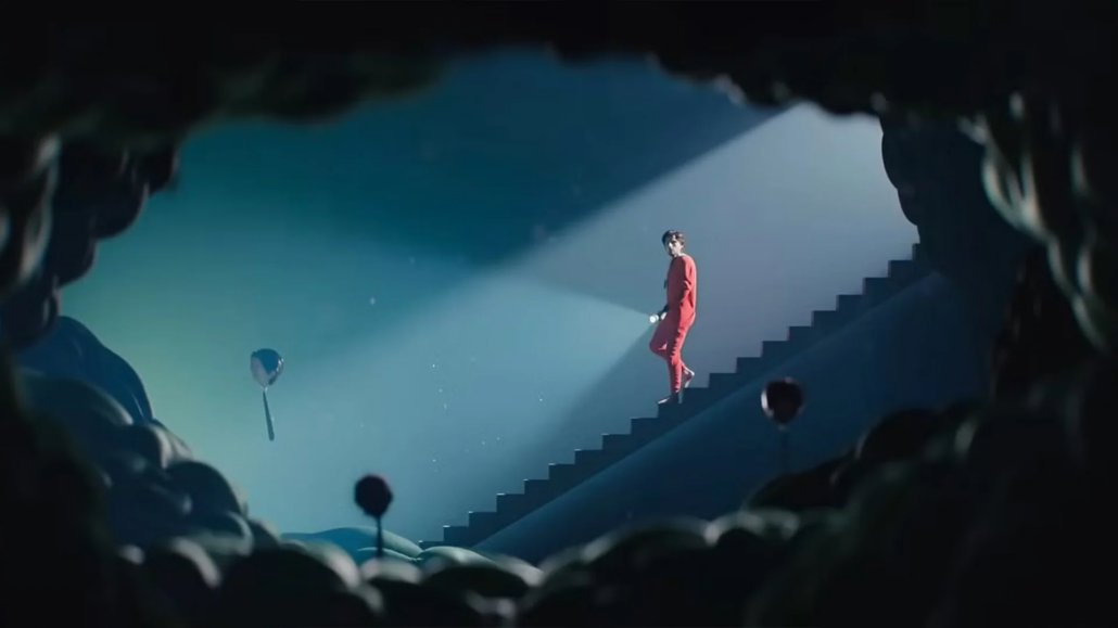
The viewer in the dark, before the film begins. That moment belongs entirely to the designer. No dialogue, no narrative, no actor performance. Just type, motion, color, and intent.
That’s the job. It’s a graphic design job. And it’s one of the best ones in the building.
If you want to learn the tools and thinking behind work like this, take a look at our Graphic Design program at the Los Angeles Film School.